


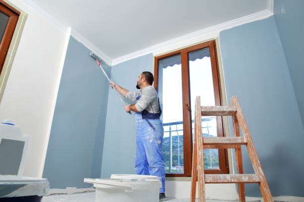
A paint color that looks perfect on a sample card can appear completely different after it is applied to a wall. Natural light, lightbulb color, room orientation, reflective surfaces, and even the selected paint finish all affect how the eye perceives color.
For Plano homeowners, understanding these changes is essential before choosing interior paint colors. Testing colors under the room’s actual lighting conditions can prevent unwanted surprises and help create a consistent look throughout the home.
Why Lighting Changes the Way Paint Looks
Color depends on light. When light reaches a painted surface, the surface absorbs some wavelengths and reflects others. The reflected light is what the eye recognizes as color. If the type, direction, or strength of the light changes, the reflected color can appear to change as well.
Lighting may make paint look:
- Warmer or cooler
- Lighter or darker
- Brighter or more muted
- More gray, yellow, blue, green, or pink
- More or less reflective
This effect is sometimes called metamerism: two colors may seem to match under one light source but look different under another. It is one reason paint should be evaluated throughout the day rather than selected from a small chip under showroom lighting.
Natural Light Changes Throughout the Day
Natural light is not constant. Morning light generally feels different from afternoon or evening light, and clouds can soften or cool the appearance of a room.
Morning light
Early daylight can make a room feel soft and clear. Depending on the window direction, cool colors may become more noticeable, while warm colors may appear slightly subdued.
Midday light
Around midday, daylight is often brighter and more neutral. Paint may look closest to its underlying color during this period, although strong sunlight can wash out pale shades.
Afternoon light
Late-day sunlight tends to feel warmer. Beige, cream, tan, red, and yellow undertones may become more noticeable, while cool colors can appear softer.
Evening light
After sunset, artificial lighting becomes the main influence. A color that felt balanced during the day may look warmer, cooler, darker, or less saturated under indoor fixtures.
Testing samples at several times of day helps reveal these changes before an entire room is painted.
How Window Direction Affects Interior Paint Colors
The direction a room faces influences the amount and character of its natural light.
North-facing rooms
North-facing rooms often receive softer, cooler indirect light. Gray, blue, or green undertones may become stronger, and some colors can appear darker than expected.
Warm whites, gentle creams, warm neutrals, and selected earthy shades may help balance the cooler light. However, the best option depends on the flooring, furnishings, and artificial lighting.
South-facing rooms
South-facing rooms typically receive stronger, warmer light for much of the day. Colors may appear brighter, and warm shades can become more intense.
Many cool or neutral colors perform well in these spaces because the natural warmth keeps them from feeling too cold. Very pale colors may look washed out when direct sunlight is strongest.
East-facing rooms
East-facing rooms receive warmer, brighter light in the morning and cooler, dimmer light later in the day. A color may look cheerful at breakfast but noticeably grayer by evening.
Evaluate samples during both morning and afternoon hours, especially when the room is used throughout the day.
West-facing rooms
West-facing rooms can feel cooler in the morning and warm or golden in the late afternoon. Warm paint colors may become significantly richer as the sun lowers.
If the room receives strong afternoon sunlight, test whether the chosen color becomes too intense or too yellow during that period.
Artificial Lighting and Color Temperature
Lightbulbs are commonly described by color temperature, measured in kelvins. The number indicates whether the light appears warm, neutral, or cool.
Warm light
Bulbs around 2700K to 3000K produce a warm, yellowish light similar to traditional incandescent lighting. This light can enhance creams, beiges, warm whites, reds, and earthy colors. It may make cool grays or blues look duller or slightly green.
Neutral light
Bulbs around 3500K to 4000K create a clearer, more balanced appearance. They can work well in kitchens, bathrooms, offices, and utility areas where visibility is important. Some homeowners find the higher end of this range less relaxing in bedrooms or living rooms.
Cool daylight-style light
Bulbs around 5000K or higher create a crisp, bluish-white appearance. They may strengthen blue and gray undertones while making warm colors feel less cozy. These bulbs are often used in work areas but can feel stark in residential living spaces.
Kelvin rating is only one factor. Color rendering quality also matters. A bulb with better color-rendering performance generally shows paint, fabrics, flooring, and artwork more accurately.
Different Bulbs Can Make One Room Look Inconsistent
Mixing warm and cool bulbs in connected fixtures can make walls appear uneven even when the paint application is consistent. For example, a hallway illuminated by warm bulbs may make a neutral wall appear beige, while a nearby room with cool bulbs makes the same color look gray.
Before selecting paint:
- Use consistent bulb temperatures within connected spaces
- Replace mismatched or failing bulbs
- Evaluate the room with the lighting normally used
- Consider whether fixtures cast light upward, downward, or across the walls
- Check how lamps, recessed lights, and decorative fixtures interact
If new fixtures or bulbs are part of the remodeling plan, choose them before approving the final paint color whenever possible.
Interior Paint Finish Also Affects Color
The interior paint finish determines how much light the surface reflects. Even when the color formula is identical, matte, satin, and gloss versions can look different.
Matte and flat finishes
Low-sheen finishes absorb more light and create a soft appearance. They can make deep colors feel rich and help conceal small surface imperfections. In a dim room, however, a dark matte color may feel heavier.
Eggshell and satin finishes
These finishes reflect a moderate amount of light. Colors may appear slightly brighter or more active than they do in matte paint. The changing reflection can also make the shade look different from one viewing angle to another.
Semi-gloss and gloss finishes
Higher-sheen paints reflect more light and may make colors appear clearer or more intense. They also highlight dents, seams, patches, and texture. Gloss is commonly used on trim, doors, cabinetry, and architectural details rather than entire walls.
Always test the actual finish you plan to use. A matte sample does not accurately show how the same color will behave in satin or semi-gloss.
Wall Texture and Drywall Condition Matter
Lighting can emphasize more than color. It can reveal drywall seams, sanding marks, patches, dents, and inconsistent texture. Light that travels across a wall from the side—often called raking light—makes surface imperfections especially visible.
Before painting, inspect walls near large windows, recessed lights, wall sconces, and directional fixtures. These areas may require additional preparation.
Professional painting and drywall services may include:
- Filling nail holes and dents
- Repairing cracks
- Correcting visible joints or tape
- Smoothing uneven patches
- Matching existing texture
- Priming repaired surfaces
- Replacing extensively damaged drywall
When a renovation includes new walls or ceilings, quality drywall installation and finishing create a more consistent foundation for the selected paint and lighting plan.
Flooring, Furniture, and Nearby Surfaces Reflect Color
Light can bounce from nearby materials onto the walls. Hardwood floors, colorful rugs, cabinets, countertops, window treatments, and large furniture pieces may cast subtle color onto a painted surface.
For example:
- Warm wood flooring may strengthen beige or yellow undertones.
- A green lawn outside a large window can add a faint green cast.
- Red brick outside a window may warm nearby walls.
- Dark furniture can make a pale wall appear brighter by contrast.
- White cabinets may reveal that a supposedly white wall is actually cream or gray.
Test paint beside the finishes that will remain in the room. An isolated sample card does not account for reflected color or visual contrast.
Room Size and Light Levels Influence Color Choice
Light colors reflect more light and can help a room feel open and airy. Dark colors absorb more light and may create depth, intimacy, or drama. Neither option is automatically right or wrong; the desired atmosphere should guide the decision.
In a small room with limited natural light, a pale color may help distribute available light, but a very cool white can sometimes feel dull. A warmer light neutral may create a more comfortable result.
In a large, bright room, a deeper color may prevent the space from feeling washed out. Strong daylight can support richer colors that might feel heavy in a darker area.
How Lighting Influences Popular Paint Color Trends
Following paint color trends can provide inspiration, but trending colors still need to work under the home’s lighting conditions.
Warm whites and creams
These shades can feel inviting under warm lighting but may look yellow if the bulbs and surrounding finishes also have strong warm undertones.
Greige and taupe
These balanced neutrals may lean gray in cool light and beige in warm afternoon sun. Large samples are important because the dominant undertone can change throughout the day.
Earthy greens
Muted greens can look calm and natural, but reflected light from landscaping may intensify the green. Warm artificial light may make some greens appear more olive.
Soft blues
Blue can feel refreshing in bright rooms but may turn cold or gray in north-facing areas. Warmer lighting and coordinating materials can help balance the effect.
Deep accent colors
Navy, charcoal, forest green, and other dark shades can create a striking feature wall or intimate room. Their success depends on sufficient lighting and proper surface preparation.
Choose trends selectively and consider how the color will look with the home’s fixed materials over time.
The Best Way to Test Interior Paint Colors
Testing paint in the actual room is more reliable than selecting a color from a phone screen, catalog, or small chip.
Use this process:
- Narrow the choice to several promising colors.
- Obtain samples in or close to the intended finish.
- Apply each sample to a movable test board or a sufficiently large wall area.
- Place samples on more than one wall.
- View them in morning, midday, afternoon, and evening light.
- Turn on all regularly used lamps and fixtures.
- Compare the samples with flooring, trim, cabinets, and furniture.
- Observe the colors from several angles.
- Allow samples to dry completely before deciding.
Movable sample boards are useful because they allow you to evaluate the same color on a bright wall, a shadowed wall, and near important finishes without covering the room in test patches.
Common Paint and Lighting Mistakes to Avoid
Choosing paint under store lighting only
Retail lighting may be very different from the lighting in your home. Always test the color in the intended room.
Judging a color from a digital screen
Screens vary in brightness and calibration. Online images are helpful for inspiration but not precise color selection.
Testing samples too close together
Adjacent colors influence one another. Leave enough neutral space around each sample or use separate boards.
Ignoring the paint finish
Sheen changes light reflection. Test the color in the finish you plan to apply whenever possible.
Selecting paint before permanent finishes
Flooring, countertops, tile, cabinets, and other fixed features usually offer fewer options than paint. Coordinate the paint with these elements.
Using inconsistent lightbulbs
Mismatched color temperatures can make a continuous wall look different across a room. Standardize bulbs before final color approval.
Skipping drywall preparation
Bright or directional light can expose poor patches and visible seams. Repair and prime the surface before applying the final coats.
Why Professional Painting Services Help
Professional painting services involve more than applying color. Experienced painters can assess lighting, wall condition, room use, existing finishes, and sheen requirements before recommending a complete coating plan.
A professional can help with:
- Identifying dominant warm or cool undertones
- Coordinating colors across connected spaces
- Choosing suitable finishes for each surface
- Preparing drywall for strong natural or directional light
- Applying consistent coats without obvious lap marks
- Creating clean transitions between walls, ceilings, and trim
- Recommending sample placement before final approval
Careful application is especially important with satin and gloss finishes because reflected light may reveal roller patterns or uneven coverage.
Choose Interior Paint Colors With Emerson Pro Services
The best interior paint colors are those that work with the home’s daylight, artificial lighting, permanent finishes, and daily use. A color should be evaluated in the room—not only on a sample card—and observed from morning through evening before the final decision is made.
Emerson Pro Services provides professional painting and drywall services in Plano for complete interior updates. Whether your project requires color guidance, wall repairs, drywall installation, surface preparation, or whole-home painting, a coordinated approach can help deliver a consistent, polished result.
Contact Emerson Pro Services to discuss your Plano painting project and choose colors and finishes that look their best under your home’s actual lighting.
Contact Us:
1100 E Plano Pkwy #102, Plano, TX
972-947-5654
www.emersonproservices/plano/paint-drywall/
Frequently Asked Questions
Why does my paint color look different at night?
At night, artificial light replaces daylight. The bulb’s color temperature, color-rendering quality, brightness, and fixture direction can make paint look warmer, cooler, lighter, or darker.
What paint colors work best in rooms with little natural light?
Warm whites, light neutrals, and selected mid-tone colors may work well, but there is no universal answer. Test samples under the room’s actual artificial lighting and beside permanent finishes.
Does paint sheen change the appearance of a color?
Yes. Matte finishes reflect less light and create a softer appearance, while satin and gloss finishes reflect more light and may make a color appear brighter or more intense.
Should I choose paint before or after selecting lightbulbs?
Ideally, establish the room’s primary lighting first. At minimum, test paint under the bulb temperature and fixtures that will be used after the project is complete.
How large should a paint sample be?
A larger sample provides a more accurate impression than a small chip. Apply it to a sizeable test board or wall section and view it on multiple walls throughout the day.
Why do drywall patches show after painting?
Patches may have different texture or absorb paint differently from the surrounding wall. Improper sanding, missing primer, or a higher-sheen finish can make the repaired area more visible.